95% Task Success for Sandwich Customization
Overview
The challenge was two-fold: design a sandwich customization app that meets user preferences, dietary needs, and budget constraints, while ensuring a fast, efficient ordering process.
The goal was to launch a functional MVP that could be quickly validated by real users. Given the need to confirm user demand through research, we chose the Design Thinking framework to guide our UX design process.
Phase 1
Empathize
To understand user needs, we conducted a competitor analysis and remote user interviews.
Key Research Findings
We uncovered several reasons users wanted to customize their sandwiches, challenging our initial assumptions. Beyond preferences, other significant factors emerged:
Sandwich Ordering Pain Points
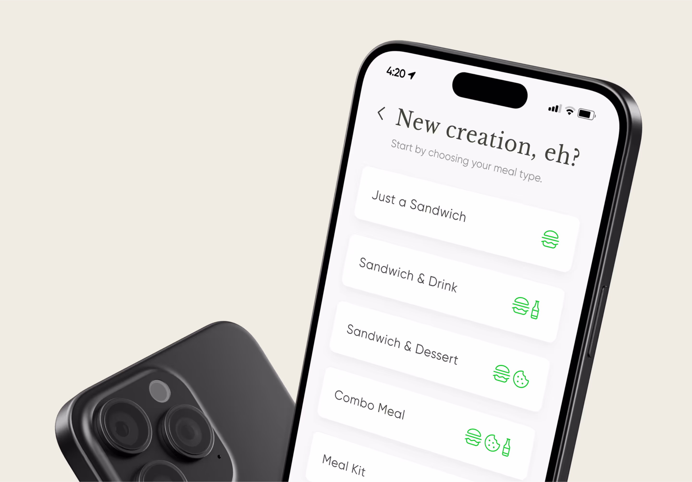
Users are dissatisfied with fixed menu items and want greater control over modifications.
Users want to adjust both to match their needs
Users feel rushed when ordering in-store, often leading to suboptimal choices.
Phase 2
Define
The user research in phase one gave us a clearer understanding of who the users are and their typical ordering behaviors. With this insight, we articulated the core problems through problem statements and mapped the user journey, providing a clear path to guide the design process.


Phase 3
Ideate
With a solid understanding of the users and their profiles, we were ready to address the core issue at hand and begin designing concrete solutions.
Phase 4
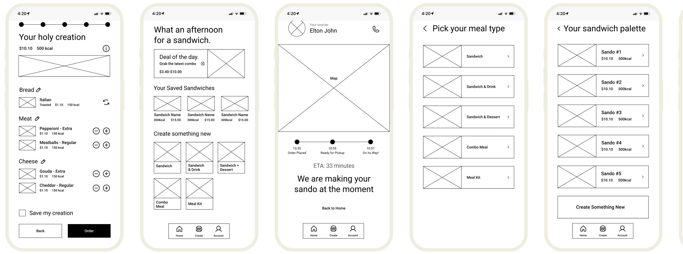
Prototype
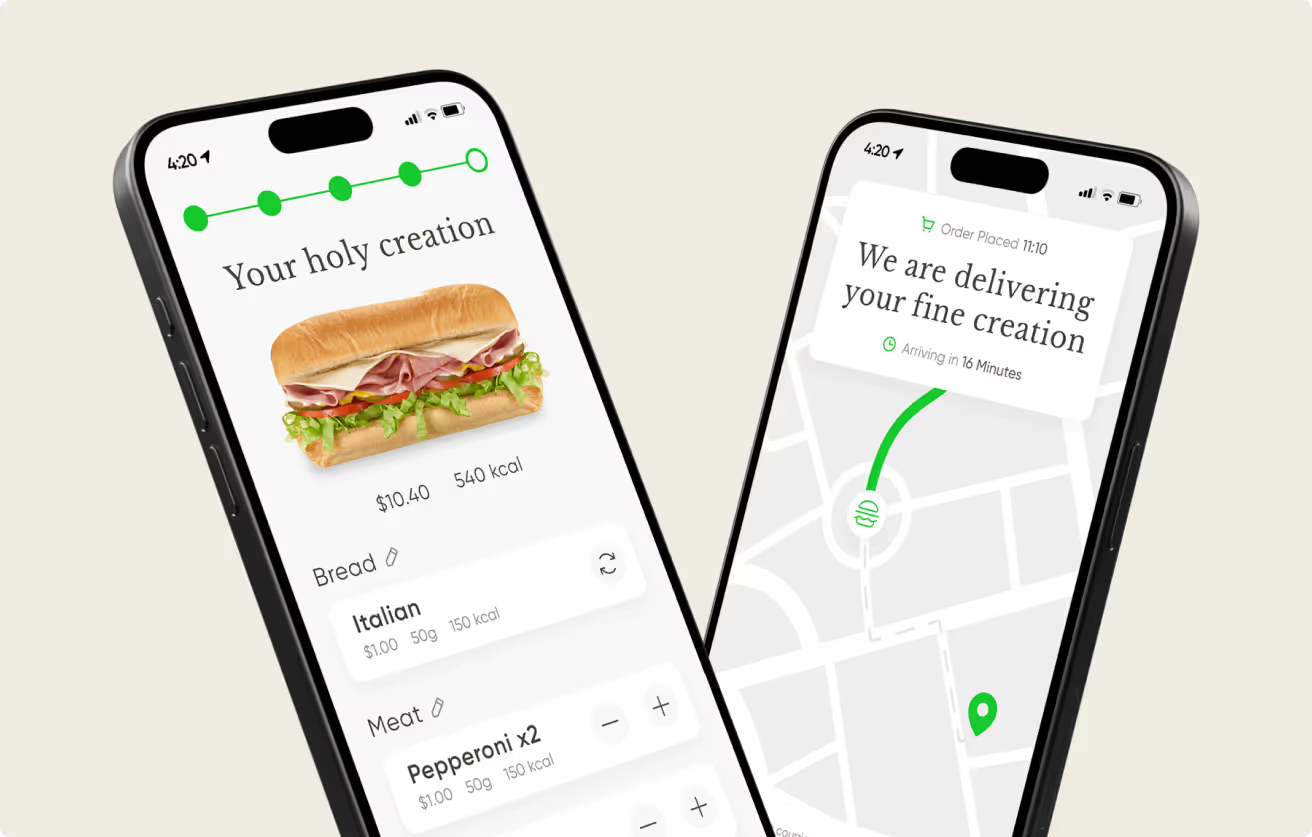
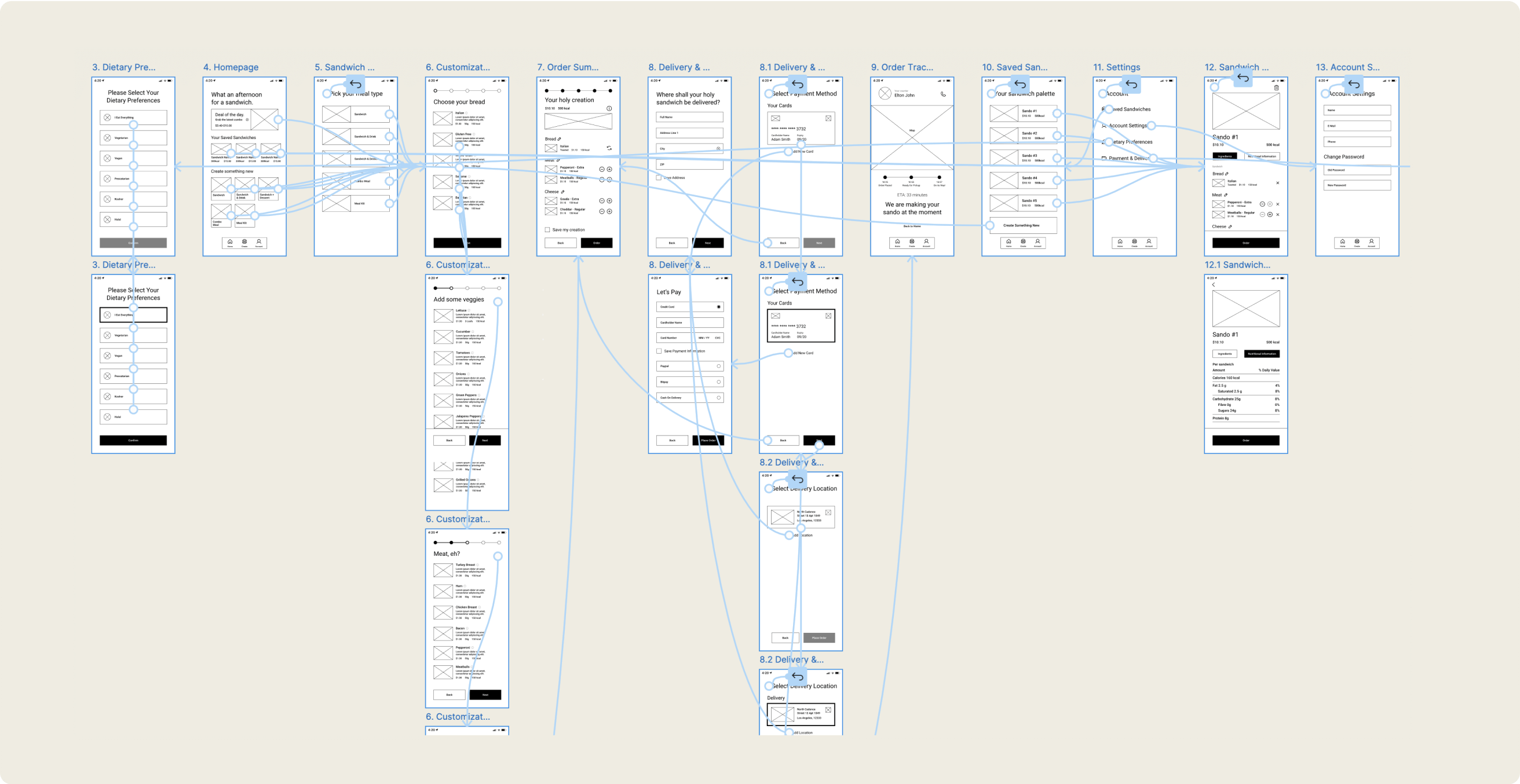
In the fourth phase, we developed low- and high-fidelity prototypes to simulate user interactions and test the app’s functionality. These prototypes allowed us to quickly gather feedback and iterate on the design, refining the user experience before moving into final development.
Phase 5
Test
In the low-fidelity phase, we conducted a moderated usability study with a selected group of users. This study revealed 26 potential improvements across 8 key areas (affinity-mapped for clarity). Key challenges identified included:
Users expected more diverse payment methods.
Filling out these sections proved cumbersome.
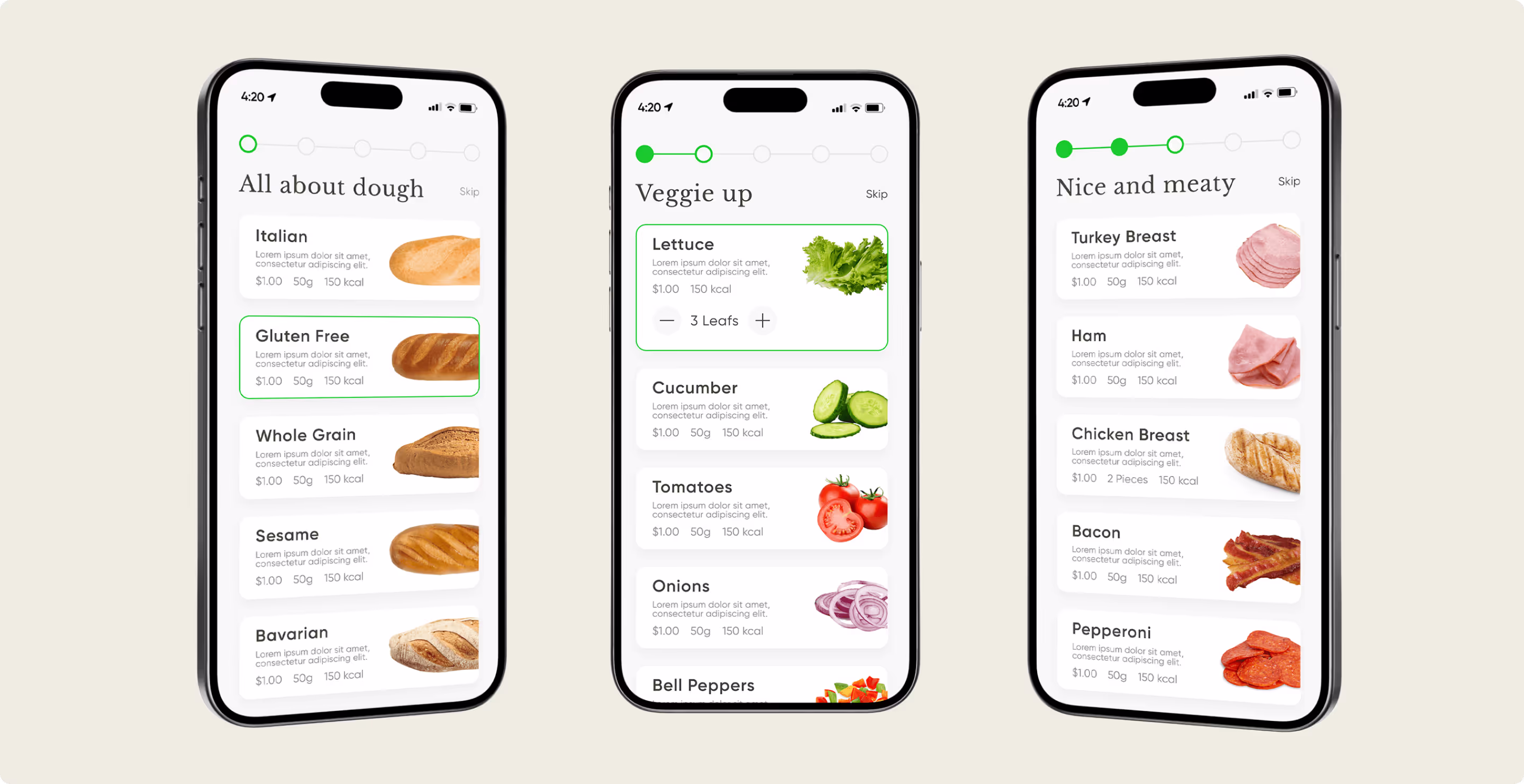
Without clear allergen and calorie information, the process was inefficient, and two-thirds of users requested more ingredient variety.
Based on these insights, we revisited the design to address the pain points. We then developed final mockups and high-fidelity prototypes, which were tested in a second usability study to ensure the solutions were effective and the interface was user-friendly.

Results &
Impact
A second moderated usability study confirmed the success of the first round, with no new pain points identified and a strong task completion rate. The Build-a-Bite app exemplifies how thorough user research uncovers and solves critical user needs. This structured research process led to a well-grounded MVP, providing a strong foundation for further product development.